COVID-19 is ravaging the globe. Let’s look at the excellent Johns Hopkins dataset using Pandas. This will serve both as a guideline for getting the data and exploring on your own, as well as an example of Pandas multi-indexing in an easy to understand situation. I am currently involved in science-responds.
My favorite links: worldometer • arcGIS • Projections
A few more: COVID-19 dash • nCoV2019 • 91-DIVOC
import pandas as pd
import numpy as np
import matplotlib.pyplot as plt
import matplotlib.dates as mdates
from urllib.error import HTTPError
from typing import Optional

plt.style.use("ggplot")
Anyway, now that we’ve made some basic imports, let’s write a function that can read in a datafile from GitHub:
def valid_name(name: str) -> bool:
    "Return True if this is a valid name in the dataset. Faster parsing this way."

    return name.replace("/", "_").replace(" ", "_") in {
        "Country_Region",
        "Province_State",
        "Admin2",
        "Confirmed",
        "Deaths",
        "Recovered",
    }
def get_day(day: pd.Timestamp):
    # Read in a datafile from GitHub
    try:
        table = pd.read_csv(
            "https://raw.githubusercontent.com/CSSEGISandData/COVID-19/"
            "master/csse_covid_19_data/csse_covid_19_daily_reports/"
            f"{day:%m-%d-%Y}.csv",
            usecols=valid_name,
        )
    except HTTPError:
        return pd.DataFrame()

    # Cleanup - sadly, the format has changed a bit over time - we can normalize that here
    table.columns = [f.replace("/", "_").replace(" ", "_") for f in table.columns]

    # This column is new in recent datasets
    if "Admin2" not in table.columns:
        table["Admin2"] = None

    # If the last update time was useful, we would make this day only, rather than day + time
    #   table["Last_Update"] = pd.to_datetime(table["Last_Update"]).dt.normalize()
    #
    # However, last update is odd, let's just make this the current day
    table["Last_Update"] = day

    # Make sure indexes are not NaN, which causes later bits to not work. 0 isn't
    # perfect, but good enough.
    # Return as a multindex
    return table.fillna(0).set_index(
        ["Last_Update", "Country_Region", "Province_State", "Admin2"], drop=True
    )
Now let’s loop over all days and build a multi-index DataFrame with the whole
dataset. We’ll be doing quite a bit of cleanup here as well. If you do this
outside of a function, you should never modify an object in multiple cells;
ideally you create an object like df, and make any modifications and
replacements in the same cell. That way, running any cell again or running a
cell multiple times will not cause unusual errors and problems to show up.
def get_all_days(end_day: Optional[pd.Timestamp] = None) -> pd.DataFrame:
    # Assume current day - 1 is the latest dataset if no end given
    if end_day is None:
        end_day = pd.Timestamp.now().normalize()

    # Make a list of all dates
    date_range = pd.date_range("2020-01-22", end_day)

    # Create a generator that returns each day's dataframe
    day_gen = (get_day(day) for day in date_range)

    # Make a big dataframe, NaN is 0
    df = pd.concat(day_gen).fillna(0).astype(int)

    # Remove a few duplicate keys
    df = df.groupby(level=df.index.names).sum()

    # Sometimes active is not filled in; we can compute easily
    df["Active"] = np.clip(df["Confirmed"] - df["Deaths"] - df["Recovered"], 0, None)

    # Change in confirmed cases (placed in a pleasing location in the table)
    df.insert(
        1,
        "ΔConfirmed",
        df.groupby(level=("Country_Region", "Province_State", "Admin2"))["Confirmed"]
        .diff()
        .fillna(0)
        .astype(int),
    )

    # Change in deaths
    df.insert(
        3,
        "ΔDeaths",
        df.groupby(level=("Country_Region", "Province_State", "Admin2"))["Deaths"]
        .diff()
        .fillna(0)
        .astype(int),
    )

    return df
If this were a larger/real project, it would be time to bundle up the functions
above and put them into a .py file - notebooks are for experimentation,
teaching, and high level manipulation. Functions and classes should normally
move to normal Python files when ready.
Let’s look at a few lines of this DataFrame to see what we have:
df = get_all_days()
df
| Confirmed | ΔConfirmed | Deaths | ΔDeaths | Recovered | Active | ||||
|---|---|---|---|---|---|---|---|---|---|
| Last_Update | Country_Region | Province_State | Admin2 | ||||||
| 2020-01-22 | Antarctica | 0 | 0 | 0 | 0 | 0 | 0 | 0 | 0 |
| China | Unknown | 0 | 0 | 0 | 0 | 0 | 0 | 0 | |
| Hong Kong | Hong Kong | 0 | 0 | 0 | 0 | 0 | 0 | 0 | |
| Japan | 0 | 0 | 2 | 0 | 0 | 0 | 0 | 2 | |
| Kiribati | 0 | 0 | 0 | 0 | 0 | 0 | 0 | 0 | |
| ... | ... | ... | ... | ... | ... | ... | ... | ... | ... |
| 2023-03-09 | West Bank and Gaza | 0 | 0 | 703228 | 0 | 5708 | 0 | 0 | 697520 |
| Winter Olympics 2022 | 0 | 0 | 535 | 0 | 0 | 0 | 0 | 535 | |
| Yemen | 0 | 0 | 11945 | 0 | 2159 | 0 | 0 | 9786 | |
| Zambia | 0 | 0 | 343135 | 0 | 4057 | 0 | 0 | 339078 | |
| Zimbabwe | 0 | 0 | 264276 | 0 | 5671 | 0 | 0 | 258605 |
4287470 rows × 6 columns
The benefit of doing this all at once, in one DataFrame, should quickly become apparent. We can now use simple selection and grouping to “ask” almost anything about our dataset.
As an example, let’s look at just the US portion of the dataset. We’ll use the
pandas selection .xs:
us = df.xs("US", level="Country_Region")
us
| Confirmed | ΔConfirmed | Deaths | ΔDeaths | Recovered | Active | |||
|---|---|---|---|---|---|---|---|---|
| Last_Update | Province_State | Admin2 | ||||||
| 2020-01-22 | Washington | 0 | 1 | 0 | 0 | 0 | 0 | 1 |
| 2020-01-23 | Washington | 0 | 1 | 0 | 0 | 0 | 0 | 1 |
| 2020-01-24 | Chicago | 0 | 1 | 0 | 0 | 0 | 0 | 1 |
| Washington | 0 | 1 | 0 | 0 | 0 | 0 | 1 | |
| 2020-01-25 | Illinois | 0 | 1 | 0 | 0 | 0 | 0 | 1 |
| ... | ... | ... | ... | ... | ... | ... | ... | ... |
| 2023-03-09 | Wyoming | Teton | 12134 | 0 | 16 | 0 | 0 | 12118 |
| Uinta | 6406 | 0 | 43 | 0 | 0 | 6363 | ||
| Unassigned | 0 | 0 | 0 | 0 | 0 | 0 | ||
| Washakie | 2755 | 0 | 51 | 0 | 0 | 2704 | ||
| Weston | 1905 | 0 | 23 | 0 | 0 | 1882 |
3514066 rows × 6 columns
Notice we have counties (early datasets just have one “county” called "0").
If we were only interested in states, we can group by the remaining levels and
sum out the "Admin2" (county and similar) dimension:
by_state = us.groupby(level=("Last_Update", "Province_State")).sum()
by_state
| Confirmed | ΔConfirmed | Deaths | ΔDeaths | Recovered | Active | ||
|---|---|---|---|---|---|---|---|
| Last_Update | Province_State | ||||||
| 2020-01-22 | Washington | 1 | 0 | 0 | 0 | 0 | 1 |
| 2020-01-23 | Washington | 1 | 0 | 0 | 0 | 0 | 1 |
| 2020-01-24 | Chicago | 1 | 0 | 0 | 0 | 0 | 1 |
| Washington | 1 | 0 | 0 | 0 | 0 | 1 | |
| 2020-01-25 | Illinois | 1 | 0 | 0 | 0 | 0 | 1 |
| ... | ... | ... | ... | ... | ... | ... | ... |
| 2023-03-09 | Virginia | 2291951 | 0 | 23666 | 0 | 0 | 2268285 |
| Washington | 1928913 | 0 | 15683 | 0 | 0 | 1913230 | |
| West Virginia | 642760 | 0 | 7960 | 0 | 0 | 634800 | |
| Wisconsin | 2006582 | 708 | 16375 | 11 | 0 | 1990207 | |
| Wyoming | 185385 | 0 | 2004 | 0 | 0 | 183381 |
64902 rows × 6 columns
Using the same selector as before, we can pick out North Carolina:
by_state.xs("North Carolina", level="Province_State")
| Confirmed | ΔConfirmed | Deaths | ΔDeaths | Recovered | Active | |
|---|---|---|---|---|---|---|
| Last_Update | ||||||
| 2020-03-10 | 7 | 0 | 0 | 0 | 0 | 7 |
| 2020-03-11 | 7 | 0 | 0 | 0 | 0 | 7 |
| 2020-03-12 | 15 | 8 | 0 | 0 | 0 | 15 |
| 2020-03-13 | 17 | 2 | 0 | 0 | 0 | 17 |
| 2020-03-14 | 24 | 7 | 0 | 0 | 0 | 24 |
| ... | ... | ... | ... | ... | ... | ... |
| 2023-03-05 | 3467226 | 0 | 28389 | 0 | 0 | 3438837 |
| 2023-03-06 | 3467226 | 0 | 28389 | 0 | 0 | 3438837 |
| 2023-03-07 | 3467226 | 0 | 28389 | 0 | 0 | 3438837 |
| 2023-03-08 | 3472644 | 5418 | 28432 | 43 | 0 | 3444212 |
| 2023-03-09 | 3472644 | 0 | 28432 | 0 | 0 | 3444212 |
1095 rows × 6 columns
We can look at all of US, as well:
all_states = by_state.groupby(level="Last_Update").sum()
all_states
| Confirmed | ΔConfirmed | Deaths | ΔDeaths | Recovered | Active | |
|---|---|---|---|---|---|---|
| Last_Update | ||||||
| 2020-01-22 | 1 | 0 | 0 | 0 | 0 | 1 |
| 2020-01-23 | 1 | 0 | 0 | 0 | 0 | 1 |
| 2020-01-24 | 2 | 0 | 0 | 0 | 0 | 2 |
| 2020-01-25 | 2 | 0 | 0 | 0 | 0 | 2 |
| 2020-01-26 | 5 | 0 | 0 | 0 | 0 | 5 |
| ... | ... | ... | ... | ... | ... | ... |
| 2023-03-05 | 103646975 | -3862 | 1122134 | -38 | 0 | 102532968 |
| 2023-03-06 | 103655539 | 8564 | 1122181 | 47 | 0 | 102541485 |
| 2023-03-07 | 103690910 | 35371 | 1122516 | 335 | 0 | 102576519 |
| 2023-03-08 | 103755771 | 64861 | 1123246 | 730 | 0 | 102640653 |
| 2023-03-09 | 103802702 | 46931 | 1123836 | 590 | 0 | 102686989 |
1143 rows × 6 columns
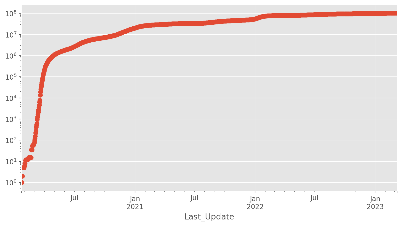
US total cases
Let’s try a simple plot first; this is the one you see quite often.
plt.figure(figsize=(10, 5))
all_states.Confirmed.plot(logy=True, style="o");
<Axes: xlabel='Last_Update'>
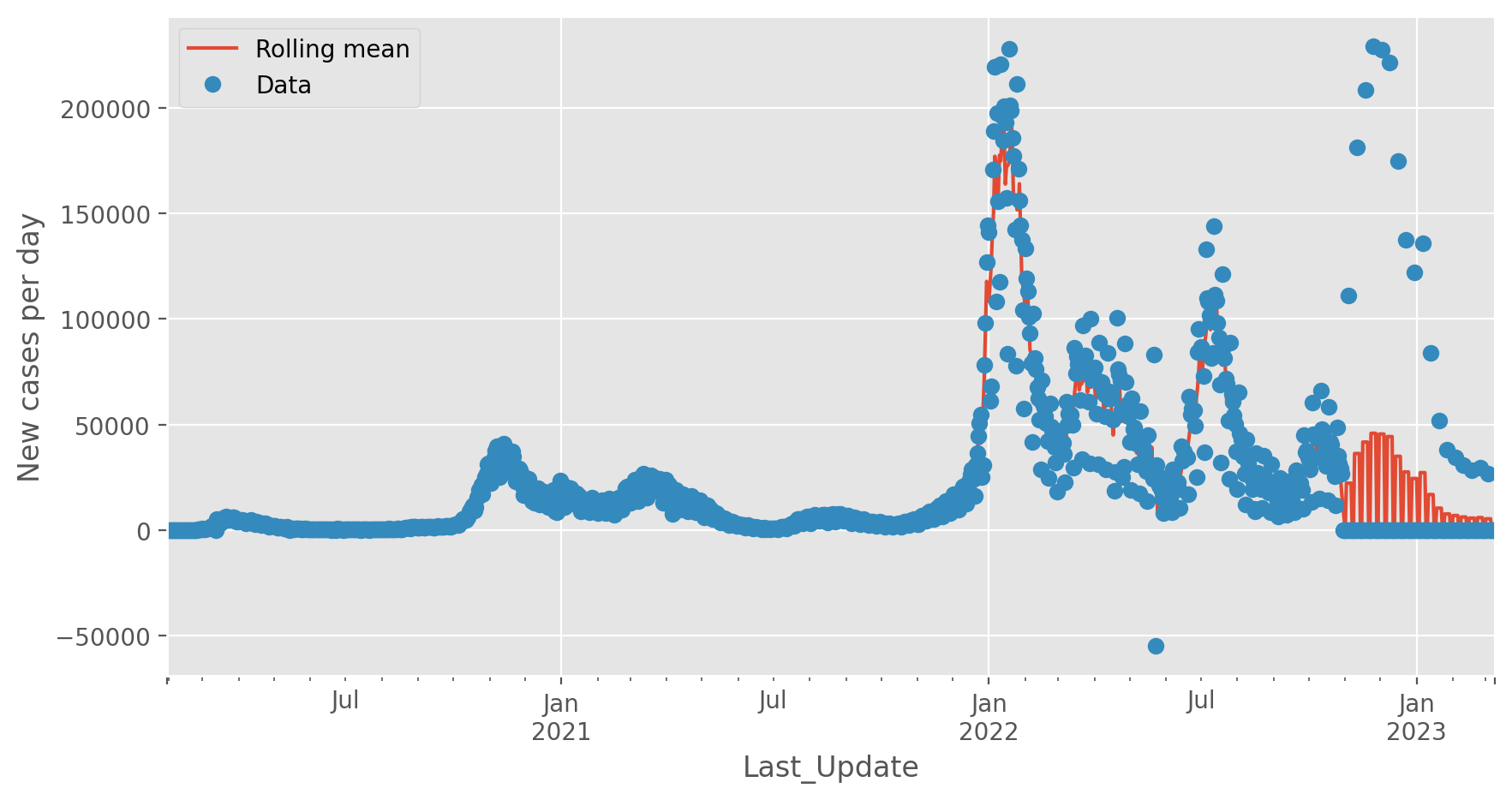
Italy, new cases per day
As another example, let’s view the new cases per day for Italy. We will add a rolling mean, just to help guide the eye through the fluctuations - it is not a fit or anything fancy.
interesting = df.xs("Italy", level="Country_Region").groupby(level="Last_Update").sum()

plt.figure(figsize=(10, 5))
interesting.ΔConfirmed.rolling(5, center=True).mean().plot(
    style="-", label="Rolling mean"
)
interesting.ΔConfirmed.plot(style="o", label="Data")
plt.ylabel("New cases per day")
plt.legend();
<matplotlib.legend.Legend at 0x1316f1f50>
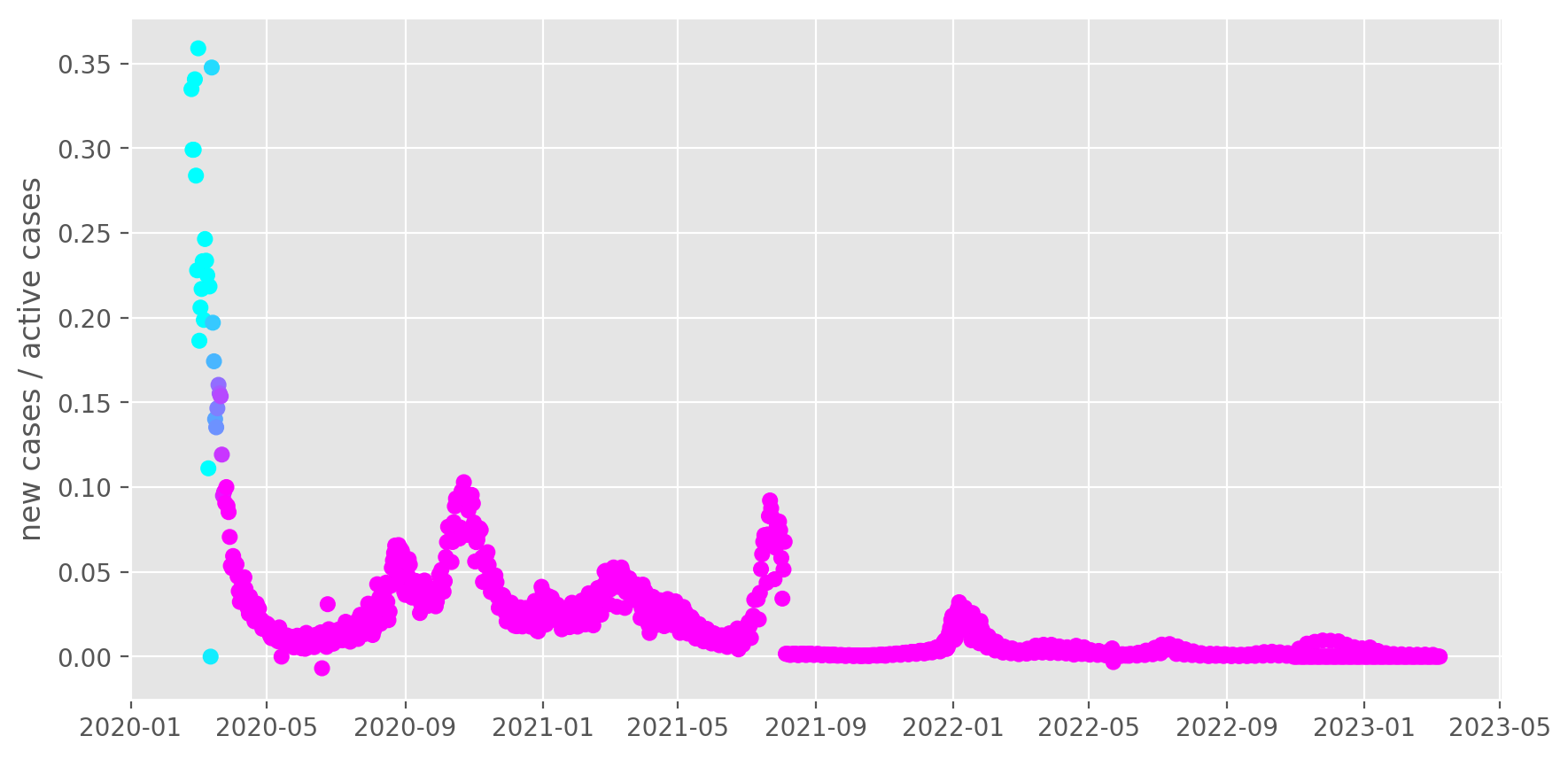
Italy, transmission rate
It’s more interesting to instead look at the transmission rate per day, which is new cases / active cases. The colors in the plot start changing when Italy implemented a lockdown on the 11th, and change over 14 days, which is roughly 1x the time to first symptoms. The lockdown make take longer than that to take full effect. There were several partial steps taken before the full lockdown on the 4th and 9th. Notice the transmission is slowing noticeably!
interesting = df.xs("Italy", level="Country_Region").groupby(level="Last_Update").sum()
growth = interesting.ΔConfirmed / interesting.Active
growth = growth["2020-02-24":]

# Color based on lockdown (which happened in 3 stages, 4th, 9th, and 11th)
lockdown = growth.index - pd.Timestamp("2020-03-11")
lockdown = np.clip(lockdown.days, 0, 14) / 14

fix, ax = plt.subplots(figsize=(10, 5))
ax.scatter(growth.index, growth, cmap="cool", c=lockdown)

ax.set_ylabel("new cases / active cases")
Text(0, 0.5, 'new cases / active cases')
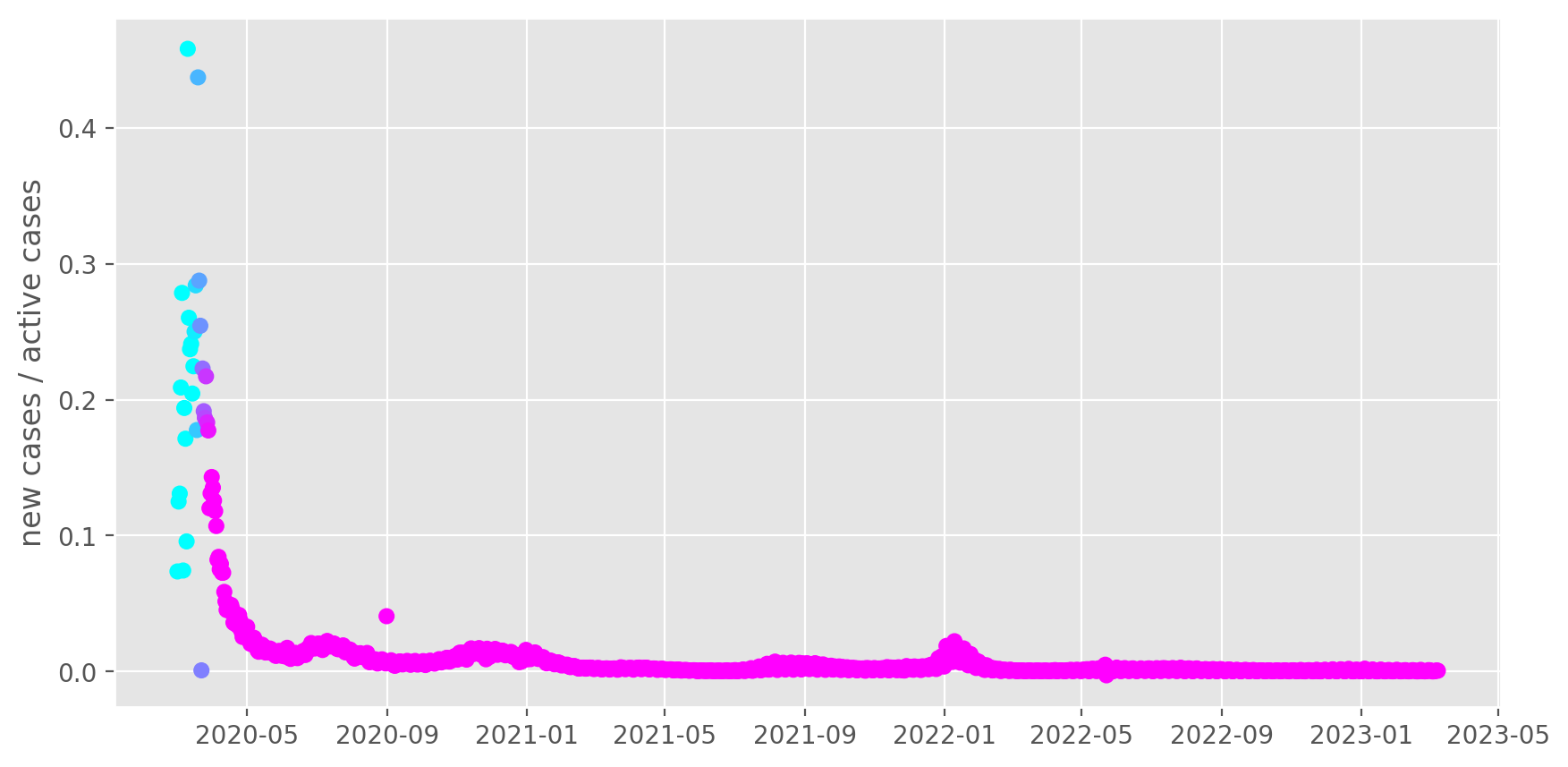
US, transmission rate
Same plot for the US. The colors in the plot start changing when the US started the 15 plan to slow the spread, and change over 14 days, which is roughly 1x the time to first symptoms. Each state has implemented different guidelines, so the effect will be spread out even futher. Again, we are see the effect of the lockdown!
interesting = df.xs("US", level="Country_Region").groupby(level="Last_Update").sum()
growth = interesting.ΔConfirmed / interesting.Active
growth = growth["2020-03-01":]

# Not really a full lockdown, just a distancing guideline + local lockdowns later
lockdown = growth.index - pd.Timestamp("2020-03-15")
lockdown = np.clip(lockdown.days, 0, 14) / 14

fix, ax = plt.subplots(figsize=(10, 5))
ax.scatter(growth.index, growth, cmap="cool", c=lockdown)

ax.set_ylabel("new cases / active cases")
Text(0, 0.5, 'new cases / active cases')